Leading a WordCamp requires an extra level of commitment, and Mervin and Avis did an incredible job this year. The following gives you a behind the scenes look at a key aspect we WCNYC lead organizers have pursued head on these last two years – branding.
Last year I was proud to lead a talented team of 18 organizers who sold-out WordCamp NYC (WCNYC) 2018. Organizers put a lot of work into planning a great WordCamp. Meryl Randman, our design lead, was in charge of branding WCNYC 2018, and she shares her story and process flow in this interview. Here’s a behind the scenes look at how our brand identity developed and how last year’s branding has been fluid into 2019.
Winstina: Meryl, one of my first thoughts after my lead organizer application was approved is that I wanted our WordCamp to be memorable. I knew I wanted it to be symbolical and reflect the spirit of NYC. When we first spoke I told you my idea of adapting Fearless Girl. Looking back on it, I think I felt I needed a little fearlessness myself.
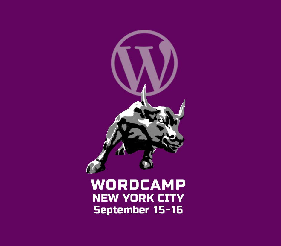
Meryl: I remember that. I did show you a rendering of the image but I was afraid that we would have legal issues. We then explored using the image of the iconic Wall Street bull. Which you can see below. Not sure why we moved away from that, maybe copyright? Regardless the logo below would have been very costly to print on t-shirts.
Winstina: I’m not sure I remember why either. We knew for sure we wanted our logo to reflect the magic of NYC. I wanted something different from the NYC skyline.
Meryl: Yes, so I came up with several directions. One was giving WordCamp more of a “camp” feel.
Winstina: They were fun. I remember smiling when I saw them.
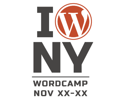
Meryl: My favorite was the idea to adapt the iconic “I Love NY” to “I WordPress NY”.
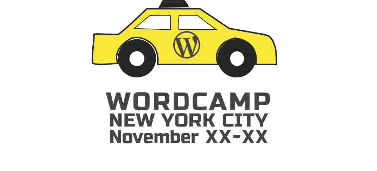
Meryl: I believe you asked if we can try a taxi image. So this is what I came up with.
Winstina: In retrospect, I am deeply appreciative that you were so invested in creating a brand for us. Not just a logo. At the same time you were developing these ideas Bud Kraus, Avis Boone and I were narrowing down our venue choices to what felt right — Convene in Time Square.
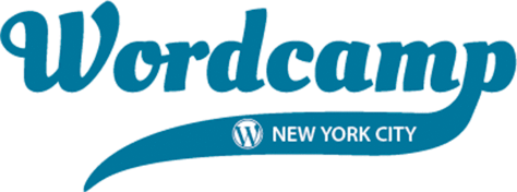
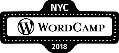
Meryl: Yes, and you encouraged me to come up with a logo that was reflective of where the conference would be held. This made sense. There is a magic to Times Square – the lights, the crowds and taxis. I presented the logo to our team that we all now know. Inspired by the lights of Broadway and a street sign.
Winstina: Know and love!
You went above and beyond by designing our website and working with our developers (Casey James Perno and Alex Raby), selecting complementary colors for our t-shirts (blue for organizers, black for volunteers, and grey for attendees), designing the pens we gifted attendees, and the logo sticker for the silicon wine glasses we gave our speakers. For the final touch, you worked with David Rosenberg who designed the signage for our schedule and the placards we placed outside each of the sessions. David became the design lead this year.
Meryl, you are the first designer I’ve worked with and you will be a very tough act to follow!
Meryl Randman leads her own design firm. Her firm works with a range of clients, from large companies to nonprofits and handles everything from websites to logos to emails to print collateral all with the goal of helping clients grow and retain their business. Visit her design firm’s website: www.merylrandman.com.